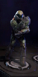
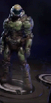
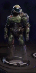
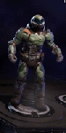
I can give you over forty thousand reasons why I know that sun isn’t real. I know it because the emitter’s Rayleigh Effect is disproportionate to its suggested size. I know it because its stellar cycle is more symmetrical than that of an actual star. But for all that, I’ll never actually know if it looks real. If it feels real.
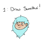
Woke up at 2am and couldn’t fall back asleep so I made a tutorial on the Photoshop techniques I use most frequently. Starting with the sketch:
adjustment layers: specifically the hue/saturation slider in this case, allows you to color correct quickly
lasso tool: for sharp edges!
alpha lock: useful for painting within a pre-defined area (especially useful when painting characters)
x (hotkey) : toggle between foreground + background colors- let’s you easily blend between 2 colors
ctrl/cmd click : quickly change current active layer. Especially useful if you’re burdened with too many layers (or just very disorganized)
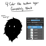
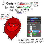
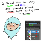
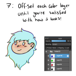
clipping mask: similar to alpha lock, but can add details without changing/ painting directly on the previous layer. I often use them to test out + apply gradients.
layer styles: I didn’t use any in this image, but the possibilities for layer styles endless, from simply adding a quick outline (useful for die cut demarcations when making stickers!) to creating more seemingly complex appearances. Here’s a gif of Nick Carver using layer styles (a combo of drop shadows + inner shadows) to quickly make the illusion of snow but with simple strokes.
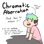
Someone on Instagram asked me about the “Chromatic Aberration” effect I put on my art, so I decided to make a small tutorial in case anyone else was wondering!
**As it says in the first picture, I use Medibang, but this should work across all other art programs!**
i see my art still getting notes and i want to be vocal about the fact ive scrolled back weeks in my activity logs just to see peoples’ tags. it’s flattering and wonderful for my (already jupiter-sized) ego